반응형
 * {
	/* flex 1차원적 배치, wrap을 통해 그리드 느낌으로 할 수 있음 */
	display : flex ; /* 한줄을 차지하는 div 요소들을 가로로 배치가능 */
	flex-direction : column /* 쌓이는 방향을 세로로 바꿔줄수있음 (기본 row) */
}

*{
	display:grid /* 부모에서 그리드의 전체적인 모양과 사이즈를 정함 */
    grid-template-columns : /* 가로 */
    grid-template-rows : /* 세로 */
    grid-template-areas : /*  */
    grid-gap : /* 그리드 간격 */
    grid-column-start :
    grid-column-end :
    grid-row-start :
    grid-row-end :
    grid-area  :
}
https://www.youtube.com/watch?v=nxi1EXmPHRs
위 유튜브를 정리해본 것 입니다.
한번에 정리해보다가 아니다 싶어서 스샷찍으며 진행
기본형
<!DOCTYPE html>
<html lang="ko">
<head>
<meta charset="UTF-8" />
<meta name="viewport" content="width=device-width, initial-scale=1.0" />
<title>Document</title>
<link rel="stylesheet" href="grid.css" />
<link rel="stylesheet" href="basic-style.css" />
</head>
<body>
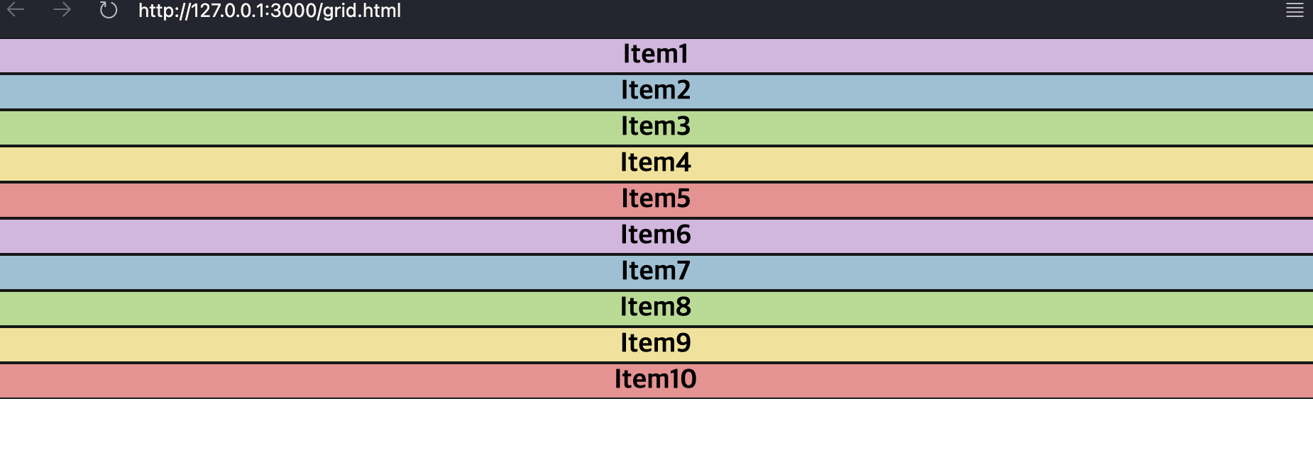
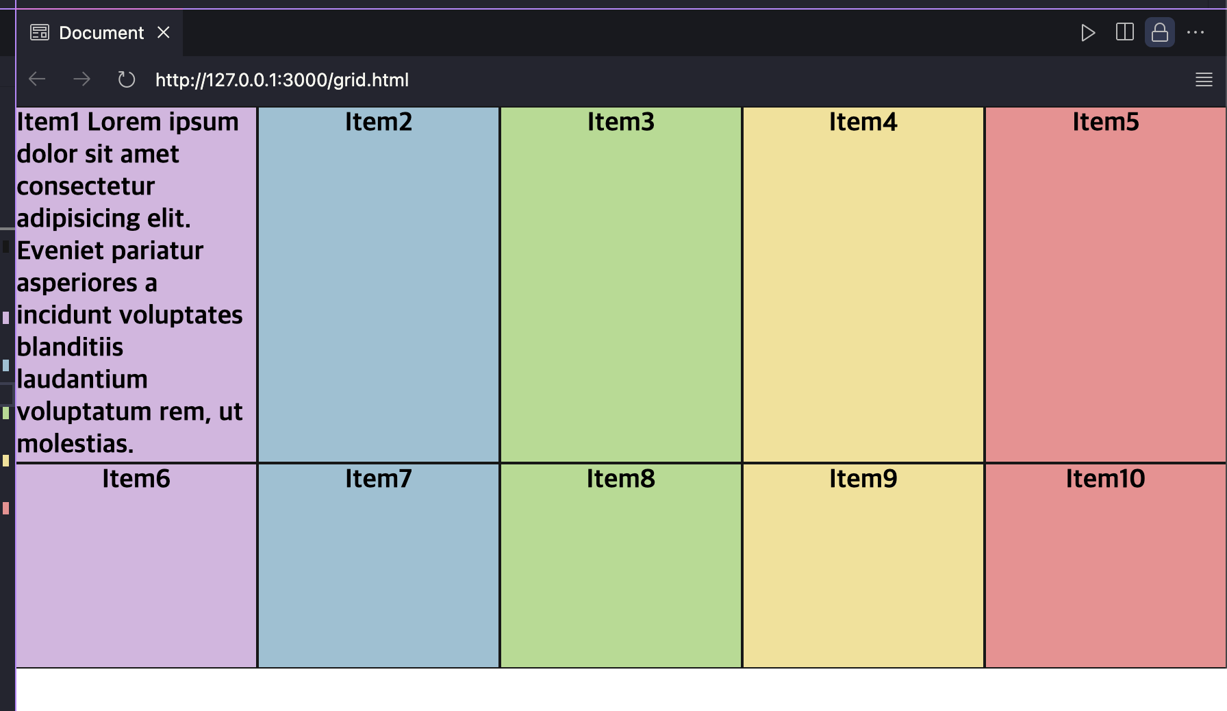
<div class="containter">
<div class="item color1">Item1</div>
<div class="item color2">Item2</div>
<div class="item color3">Item3</div>
<div class="item color4">Item4</div>
<div class="item color5">Item5</div>
<div class="item color1">Item6</div>
<div class="item color2">Item7</div>
<div class="item color3">Item8</div>
<div class="item color4">Item9</div>
<div class="item color5">Item10</div>
</div>
</body>
</html>* {
box-sizing: border-box;
}
body {
width: 100vw;
height: 100vh;
margin: 0;
}
.item {
display: flex;
justify-content: center;
border: 1px solid #181818;
font-size: 1.2rem;
font-weight: bold;
}
.color1 {
background-color: #d7bee2;
}
.color2 {
background-color: #a9c7d8;
}
.color3 {
background-color: #c0df9f;
}
.color4 {
background-color: #f2e5a6;
}
.color5 {
background-color: #e89d9d;
}
1. 부모에서 조절하는 grid 옵션
grid 적용
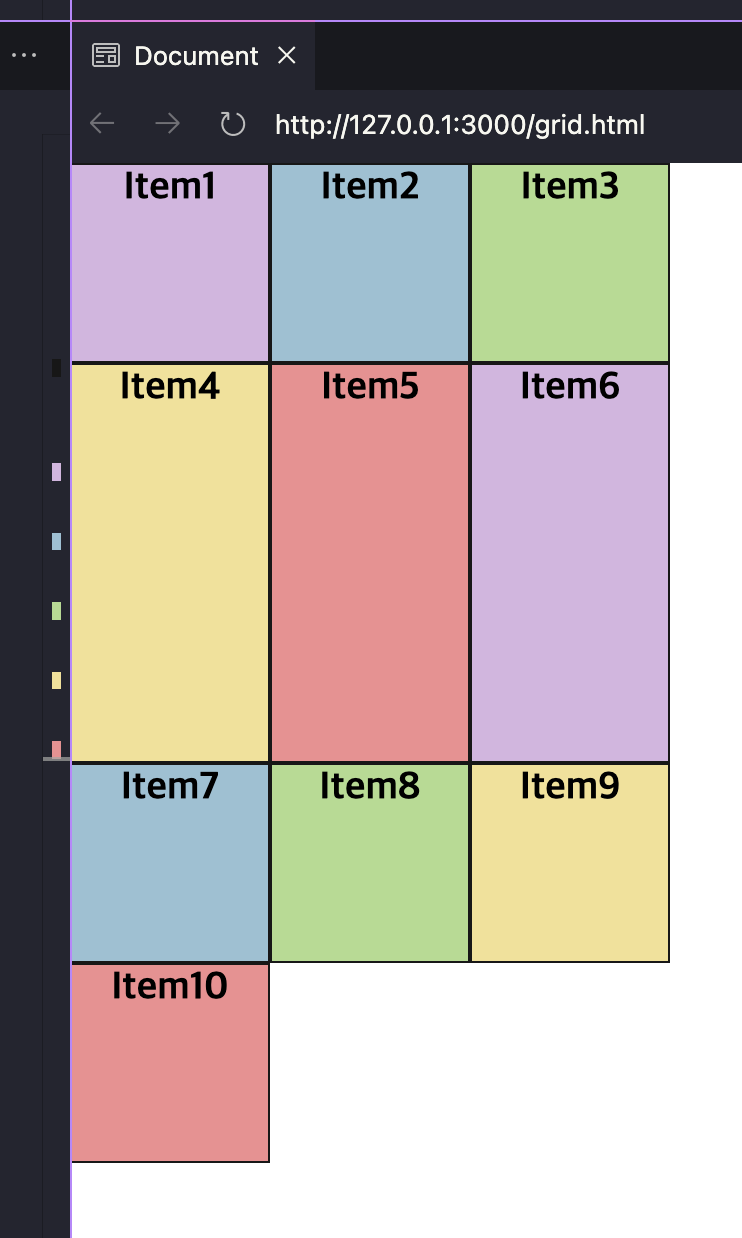
.containter {
  display: grid;
  /* 가로크기 */
  grid-template-columns: 100px 100px 100px;
  /* 세로크기 */
  grid-template-rows: 100px 200px 100px 100px;
}
repeat(반복횟수,크기) 사용
.containter {
  display: grid;
  /* repeat(반복횟수, 크기) */
  grid-template-columns: repeat(5, 100px);
  /* 세로크기 */
  grid-template-rows: 100px 200px repeat(2, 100px);
}
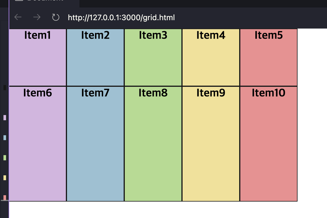
fr, auto
.containter {
  display: grid;
  /*  비율 / 사용한 fr의 총합. 여기서는 1fr이 5번반복이므로 1fr = 1/5 */
  grid-template-columns: repeat(5, 1fr);
  /* 세로크기 자동 */
  grid-auto-rows: 150px;
}
minmax(최소크기,최대크기)
.containter {
  display: grid;
  /*  비율 / 사용한 fr의 총합. 여기서는 1fr이 5번반복이므로 1fr = 1/5 */
  grid-template-columns: repeat(5, 1fr);
  /* 컨텐츠가 있는 칸은 auto로 조절됨 */
  grid-auto-rows: minmax(150px, auto);
}
gap
.containter {
  display: grid;
  padding: 10px;
  /*  비율 / 사용한 fr의 총합. 여기서는 1fr이 5번반복이므로 1fr = 1/5 */
  grid-template-columns: repeat(5, 1fr);
  /* 컨텐츠가 있는 칸은 auto로 조절됨 */
  grid-auto-rows: minmax(150px, auto);
  /* grid-gap, grid-row-gap, grid-column-gap 에서 앞의 grid-는 이제 없어도 작동 */
  gap: 10px;
  row-gap: 20px;
  column-gap: 40px;
}
2. 자식에서 조절하는 grid 옵션
start end span
<!DOCTYPE html>
<html lang="ko">
  <head>
    <meta charset="UTF-8" />
    <meta name="viewport" content="width=device-width, initial-scale=1.0" />
    <title>Document</title>
    <link rel="stylesheet" href="grid.css" />
    <link rel="stylesheet" href="basic-style.css" />
  </head>
  <body>
    <div class="containter">
      <div class="item color1">Item1</div>
      <div class="item item2 color2">Item2</div>
      <div class="item color3">Item3</div>
      <div class="item color4">Item4</div>
      <div class="item color5">Item5</div>
      <div class="item color1">Item6</div>
      <div class="item color2">Item7</div>
      <div class="item color3">Item8</div>
      <div class="item color4">Item9</div>
      <div class="item color5">Item10</div>
    </div>
  </body>
</html>
.containter {
  display: grid;
  padding: 10px;
  /*  비율 / 사용한 fr의 총합. 여기서는 1fr이 5번반복이므로 1fr = 1/5 */
  grid-template-columns: repeat(5, 1fr);
  /* 컨텐츠가 있는 칸은 auto로 조절됨 */
  grid-auto-rows: minmax(150px, auto);
  /* grid-gap, grid-row-gap, grid-column-gap 에서 앞의 grid-는 이제 없어도 작동 */
  gap: 10px;
}

.item2 {
  /* 시작은 맨왼쪽부터 1 혹은 맨오른쪽을 -1로 시작 */
  grid-column-start: 2;
  grid-column-end: 4;
  grid-row-start: 1;
  grid-row-end: 3;
}
.containter {
display: grid;
padding: 10px;
/* 비율 / 사용한 fr의 총합. 여기서는 1fr이 5번반복이므로 1fr = 1/5 */
grid-template-columns: repeat(5, 1fr);
/* 컨텐츠가 있는 칸은 auto로 조절됨 */
grid-auto-rows: minmax(150px, auto);
/* grid-gap, grid-row-gap, grid-column-gap 에서 앞의 grid-는 이제 없어도 작동 */
gap: 10px;
}
.item2 {
/*2에서 4까지*/
grid-column: 2/4;
/*1에서 2칸*/
grid-row: 1/ span 2;
}'Code > CSS' 카테고리의 다른 글
| css flex system (1) | 2024.04.19 |
|---|---|
| css grid system 2 (0) | 2024.04.19 |
| Bootstrap (1) | 2024.01.02 |
| 레이어팝업 css 반응형으로 만들기. (0) | 2023.12.28 |